

Shindig celebrates the spirit of volleyball by changing the way people experience the game through innovative play formats as well as convenience.
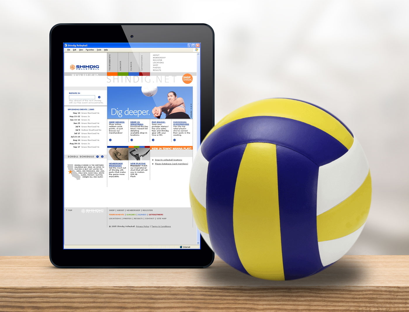
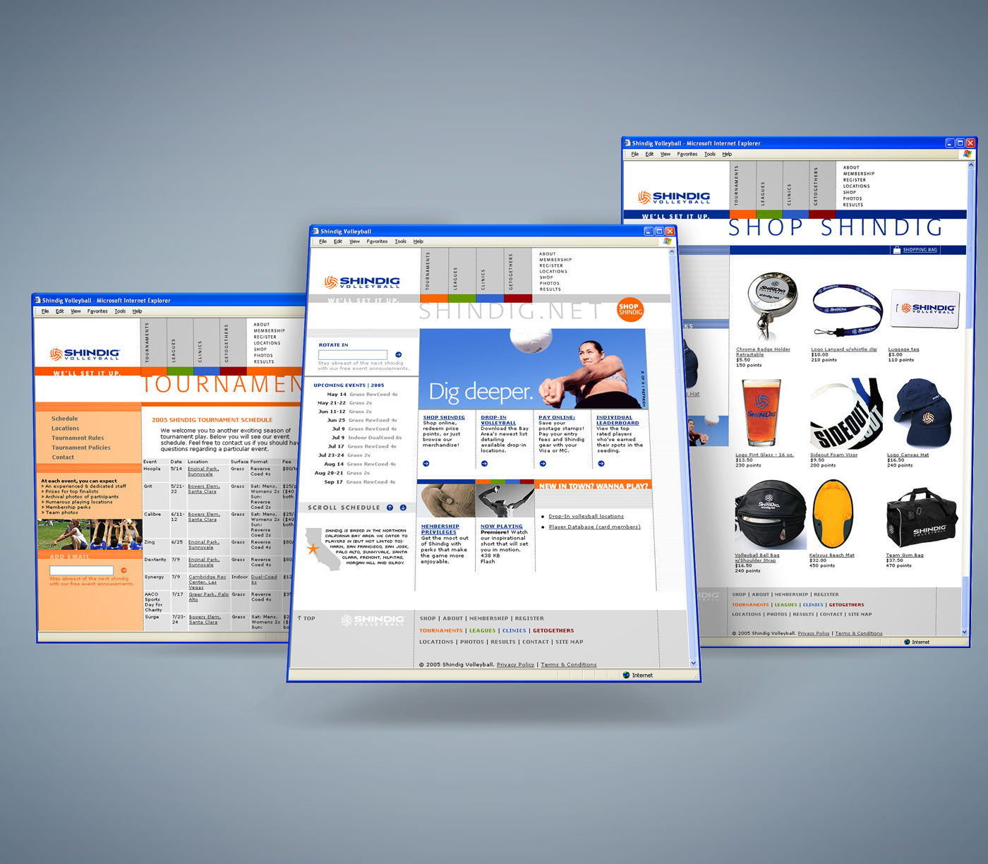
After 10 years of organizing grass roots volleyball tournaments, I desired a new identity and website to give viewers a peek into the heart and soul of the brand. The revamp resulted in a unique, informational website for both the player in search of tournaments, and curiosity seekers wanting to learn more about the game.
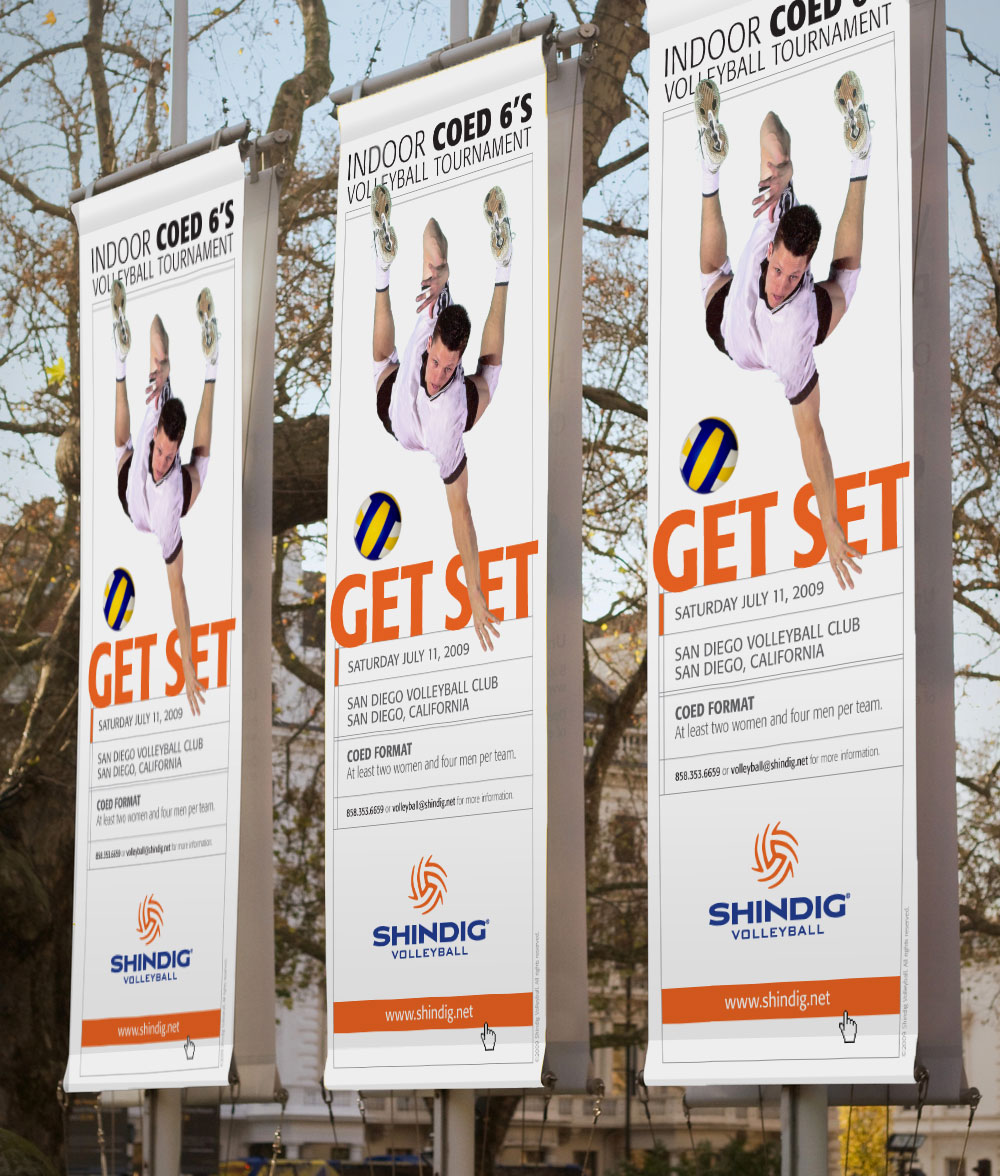
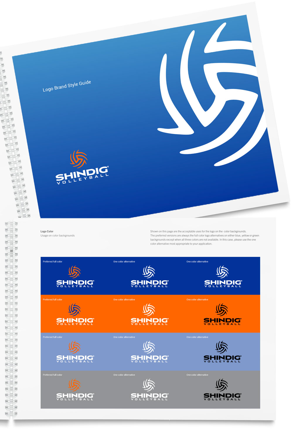
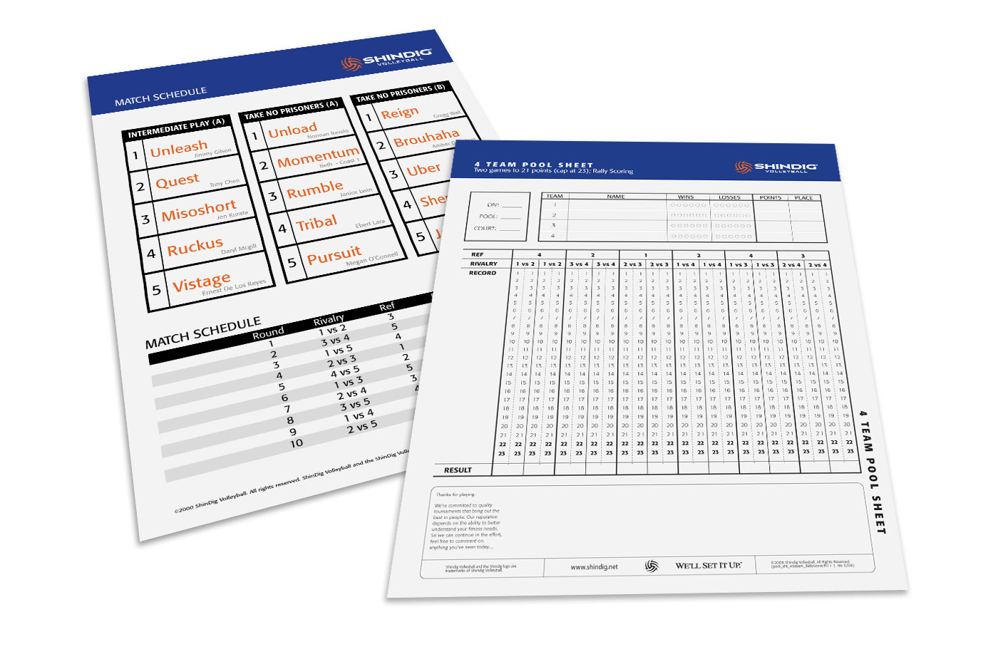
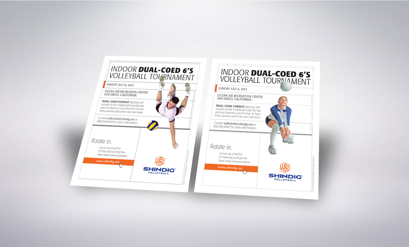
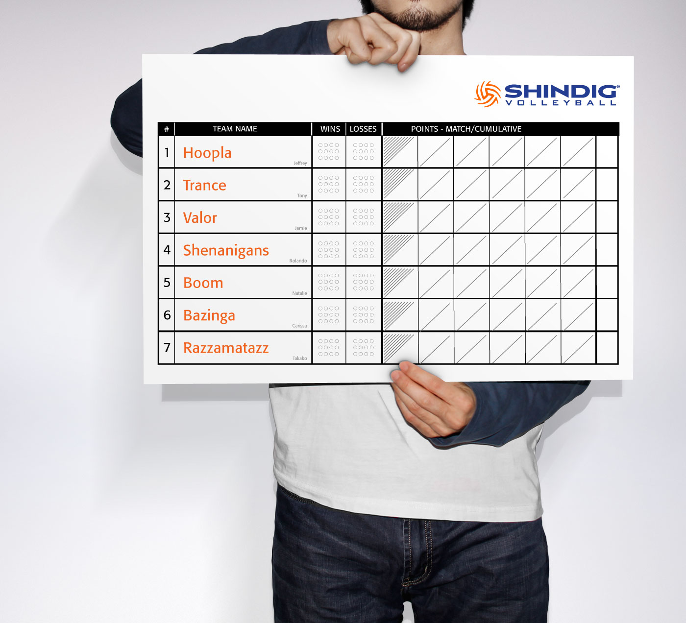
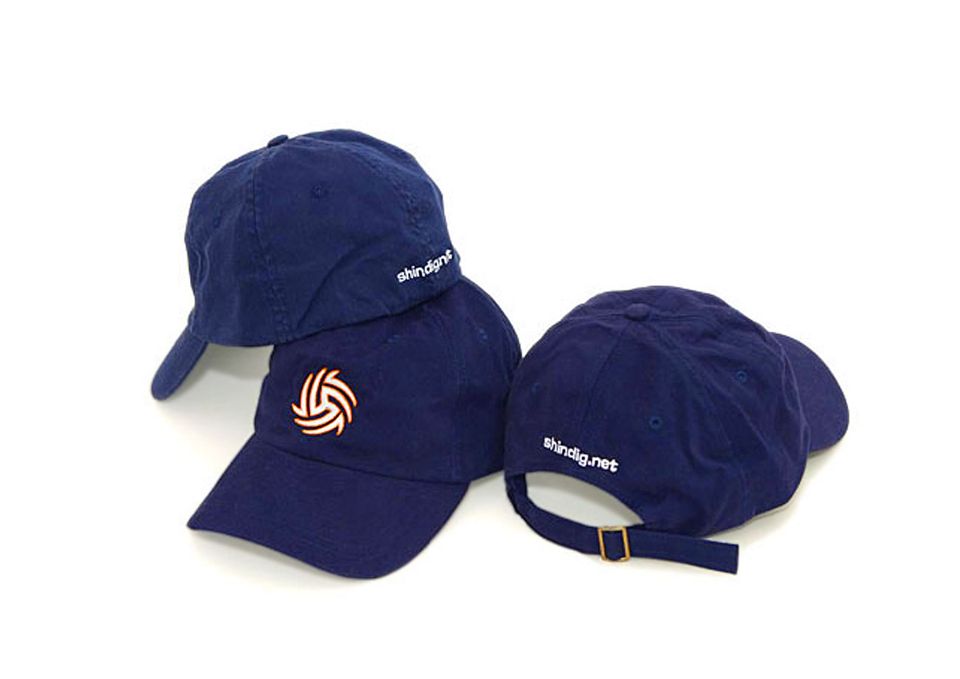
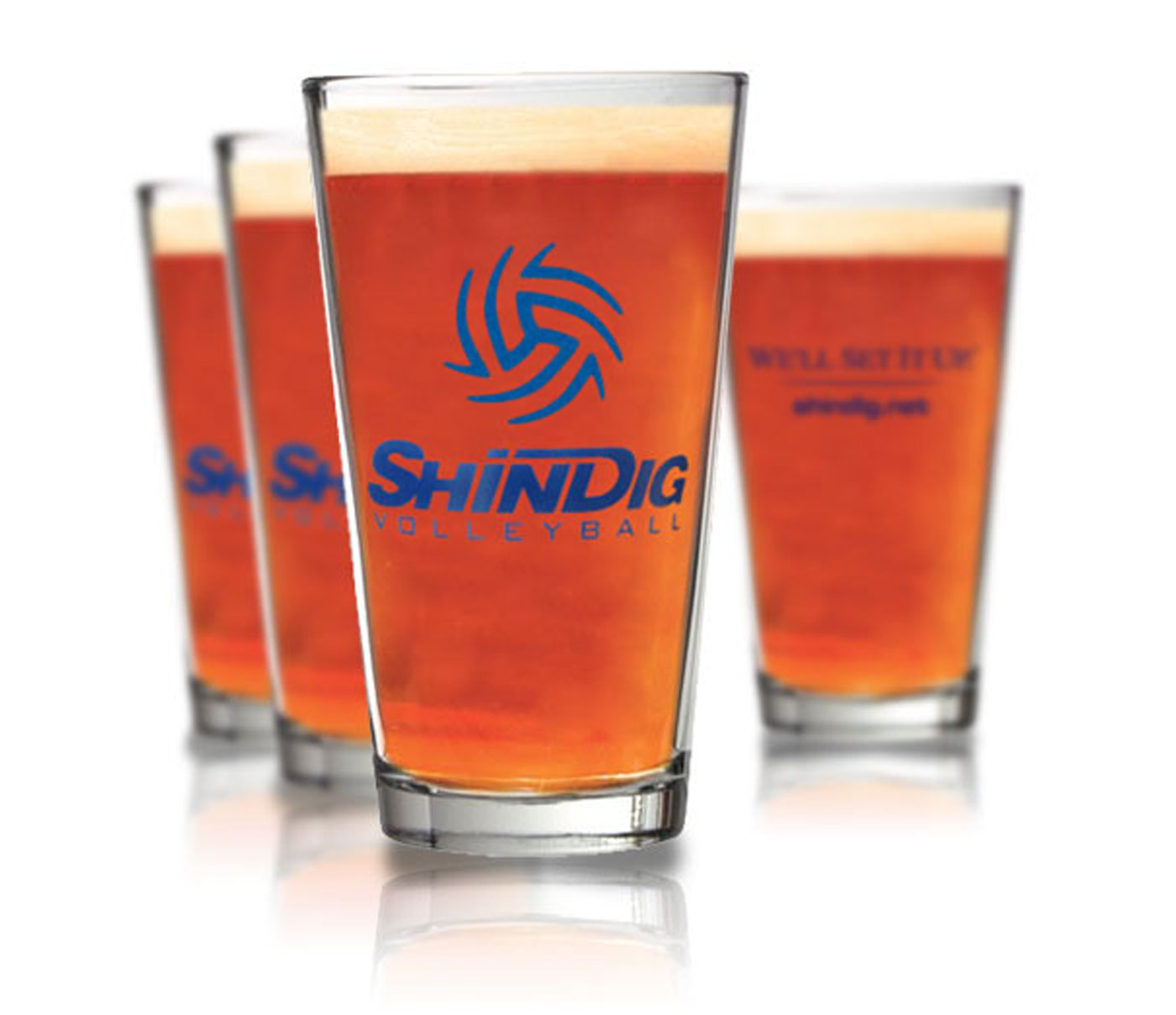
The redesigned user interface adds new features and gives players a simpler way to access information. Compelling custom photography of players and staff captures the vibrant excitement. Shindig's brand thoughtfully spans across collateral, designed with a fresh, simple color palette, and a clean style that communicates both openly yet directly.
Thanks for dropping me a line. You're swell.